Jigx Mobile Field Services
An offline-first mobile app that lets field technicians run their day reliably - even when the signal drops.
A day. Seven moments.
Zero signal required.
The thirty-second version.
Problem
Field technicians spend their day moving between sites where mobile signal is unreliable or absent. Existing tools assume connectivity, fail silently when it disappears, and bury technicians in screens that compete for attention while they're driving, climbing or fixing.
What I did
Designed an offline-first mobile app for field technicians, end-to-end. Argued for resolving each appointment as a single Travel → Work → Summary cycle instead of many small steps, cut a calendar feature that pulled focus from "today", and made sync invisible. Shipped in 2-3 months with a team of 12+.
Outcome
An offline-first product where sync stays invisible. Each appointment runs as a clear three-stage cycle - Travel, Work, Summary - so technicians always know where they are in the job, with all data writeable offline and arriving the moment signal returns.
A reference solution for the Field Service vertical.
Field Service is one of the verticals Jigx serves: companies whose technicians install, maintain, or repair equipment at customer sites - utilities, HVAC, telecoms, industrial service providers. The work is high-stakes, physically demanding, and often occurs in basements, on rooftops, in rural areas, and in steel-clad buildings where mobile coverage is patchy at best.
Existing tools assume steady connection or leak sync state in ways that force technicians to troubleshoot the app instead of doing the job. When that happens, they abandon the tool and fall back to paper - and the data the business needs never arrives.
Trust in the tool is what determines whether jobs get logged at all. Lose it once and you've lost it for the day.
How I worked through it.
Mapping the technician's day
Mapped the day end-to-end with PdM and solution design, then walked prototypes through with users. The compounding pain points: connectivity, context-switching, and granular steps that broke the rhythm of physical work.
Offline-first, no exceptions
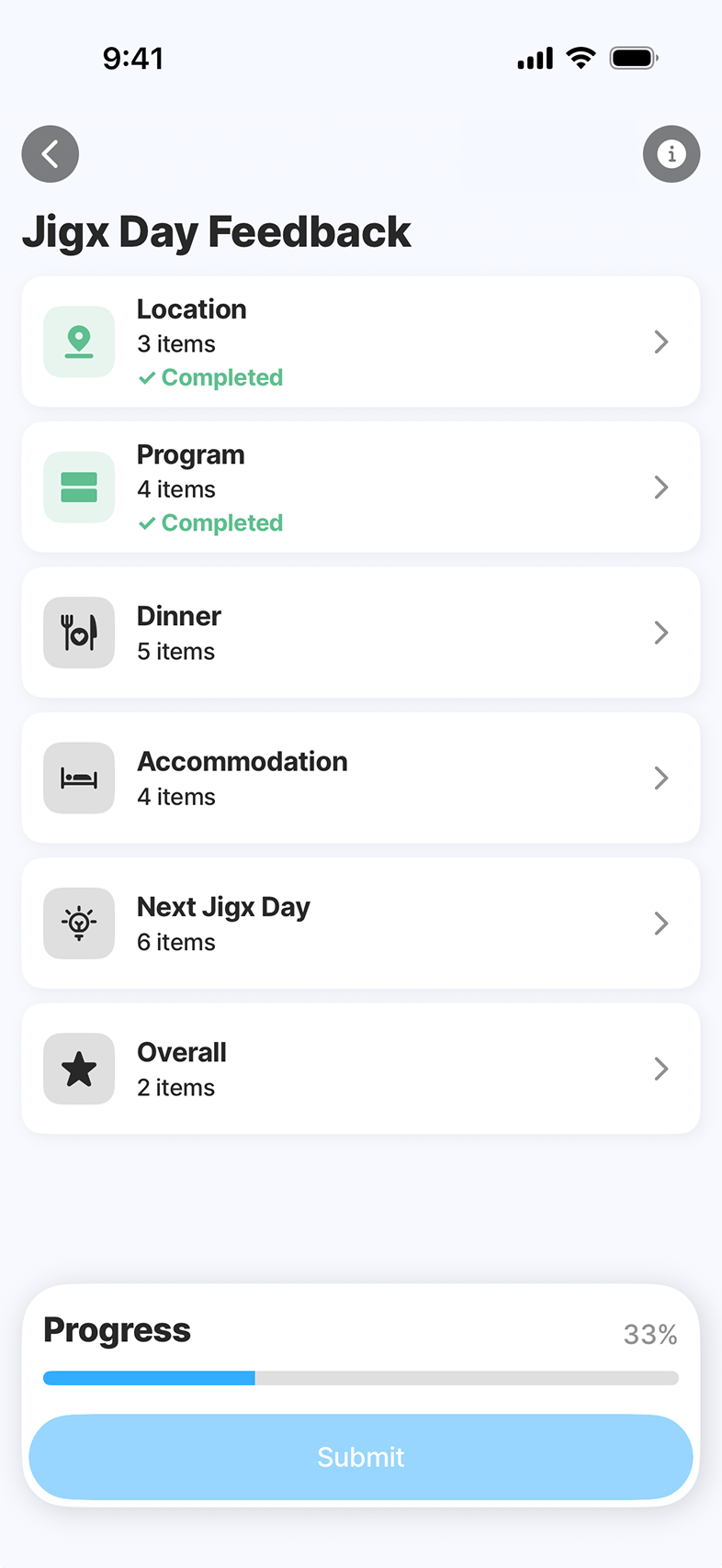
One rule above all: every screen had to work fully offline with sync invisible to the user. Each appointment was modelled as a single Travel → Work → Summary cycle, so the technician always knows where they are in the job.
Prototyping the edges
Prototyped each moment from minimal "just the next step" views to richer planning surfaces. Stress-tested edge cases: lost signal mid-job, partial uploads, late arrivals, route changes en route.
Tight feedback loops
Walked prototypes through with PdM, solution design, QA - and real users. Testing exposed where granularity confused technicians and where information density helped versus hurt. Iterated hardest on Appointment Detail and Working state.
Shipping with engineering
Worked closely with engineering throughout the two-month build - handing off specs, reviewing implementation, adjusting where the platform and the design met awkwardly. Shipped as a Jigx reference solution.
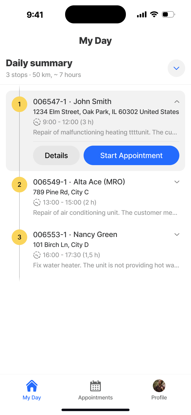
A day in seven moments.
The technician opens the app to their list of appointments for the day. They pick one, drive to the customer (Travel), do the job (Work), then check materials and have the customer sign off (Summary) - and move on to the next. Around that core cycle sit the supporting surfaces: My Day, Appointments, Appointment Detail, and Statistics. Sync runs in the background. The user never has to think about it.
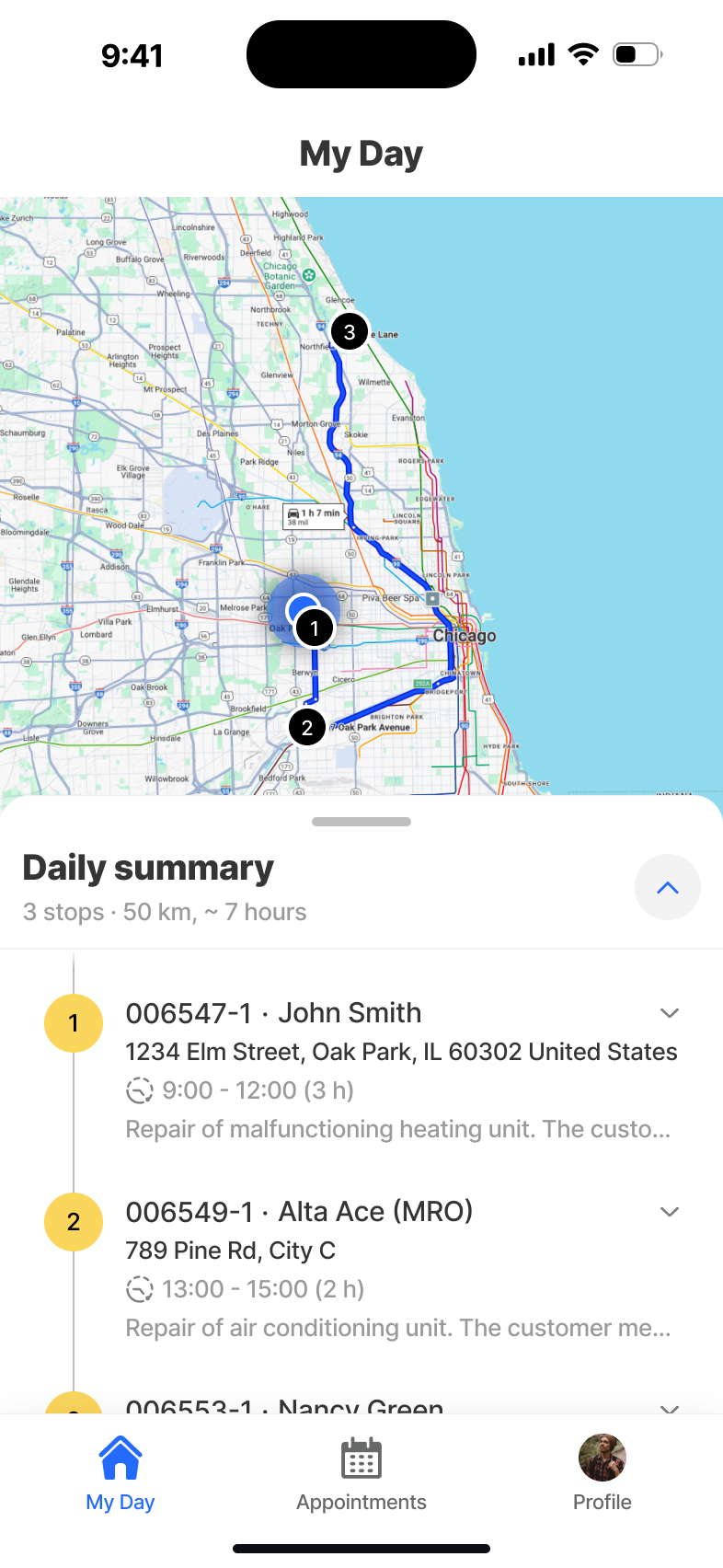
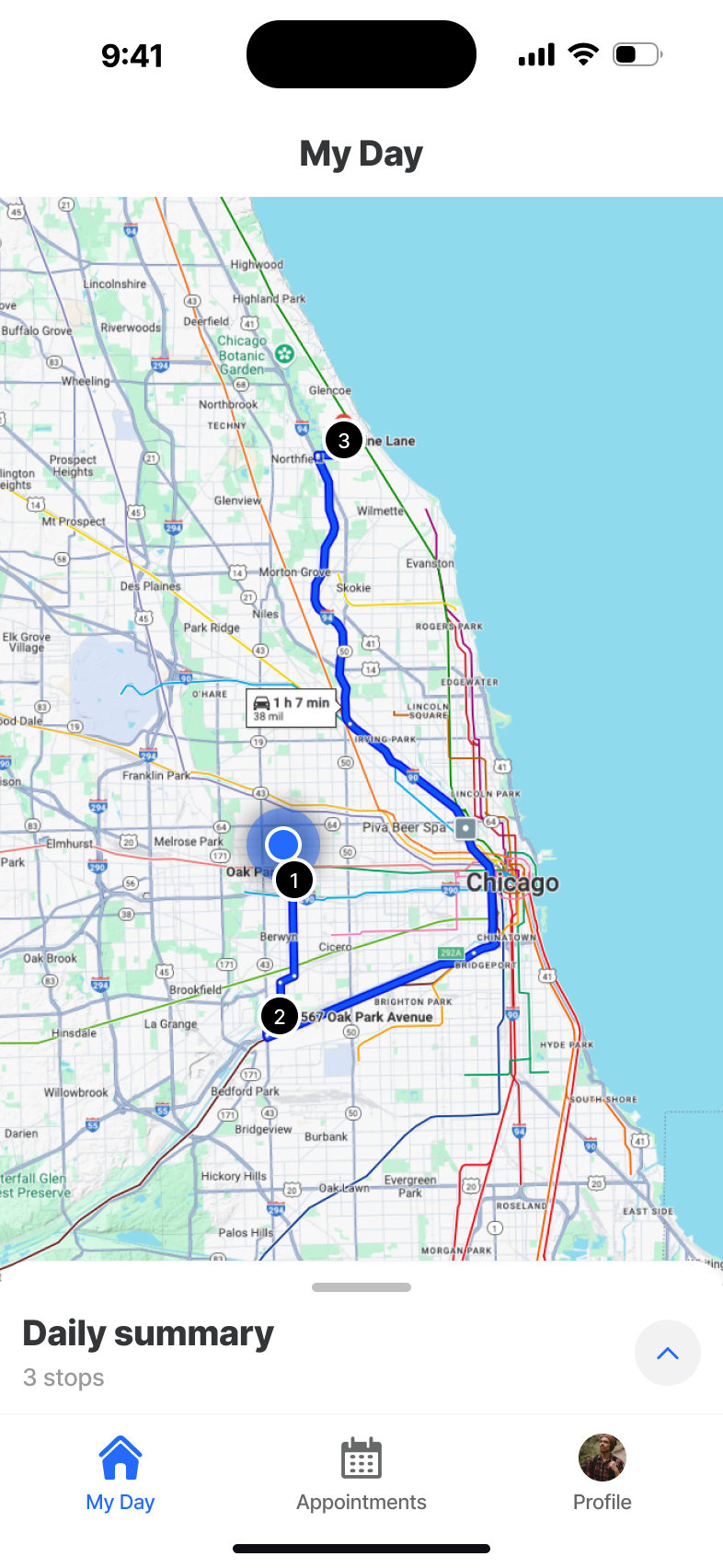
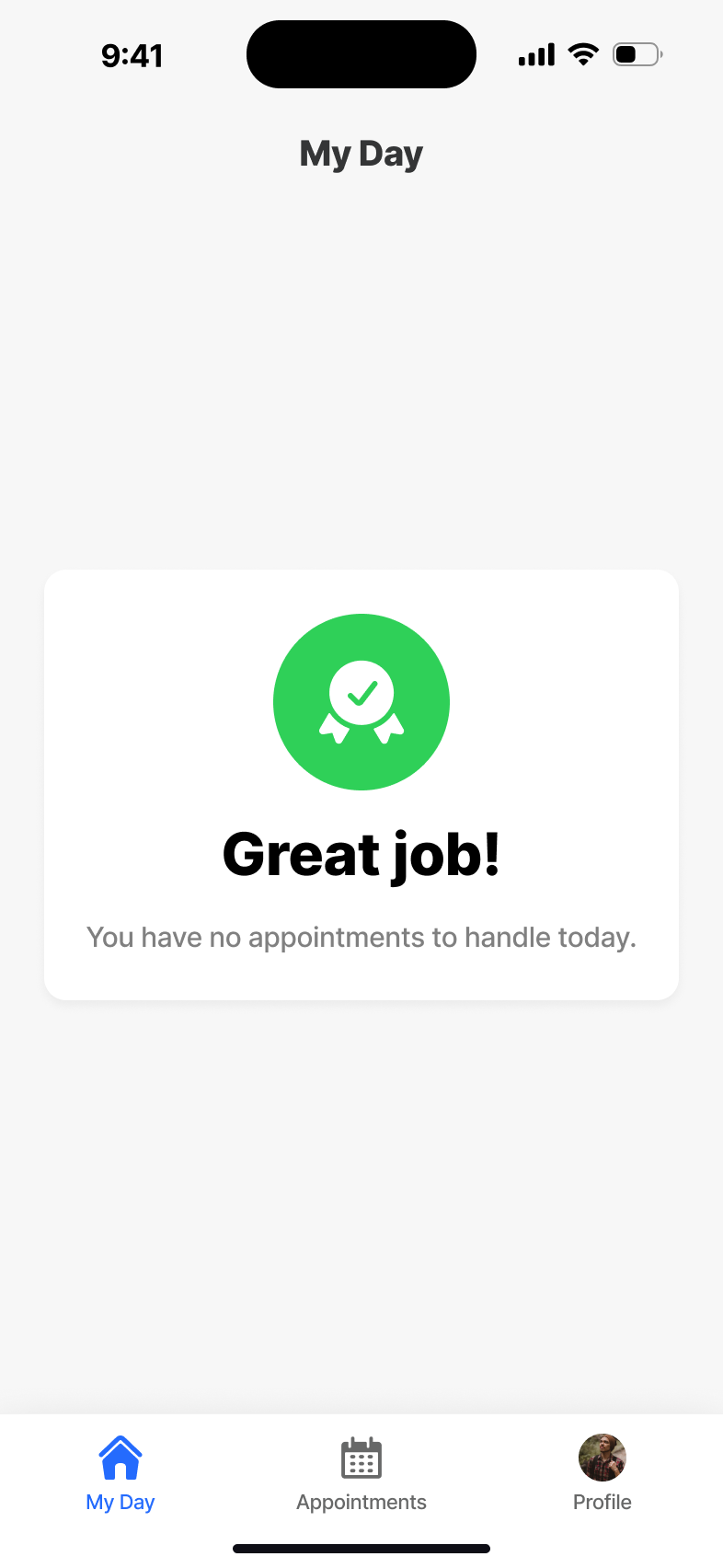
My Day
The morning landing page. A single glance gives the technician their schedule, route and progress for the day - no menus, no setup, no waiting for a network round-trip.
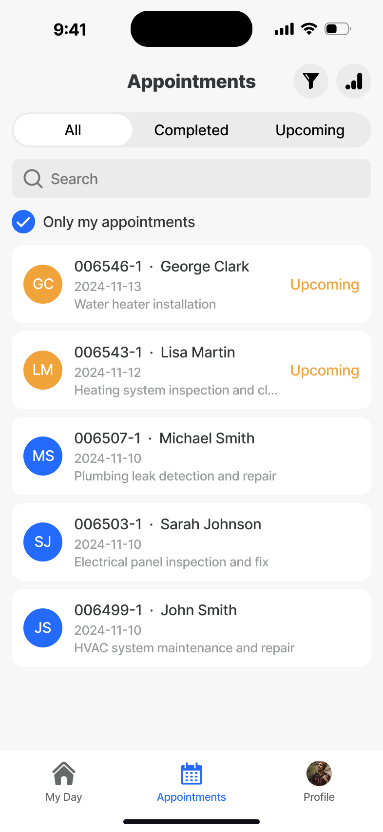
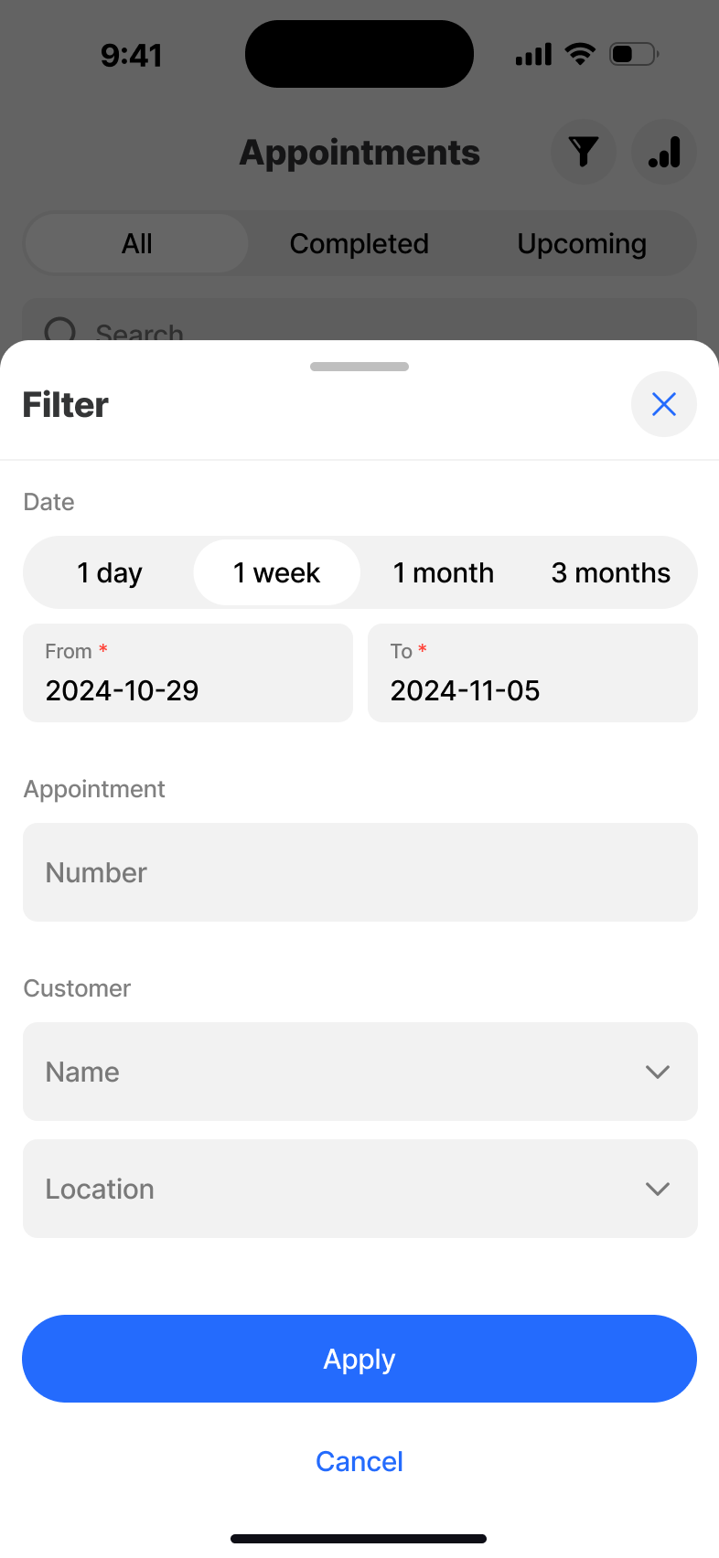
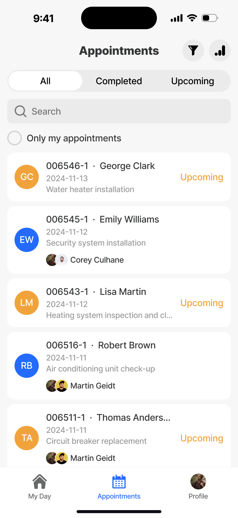
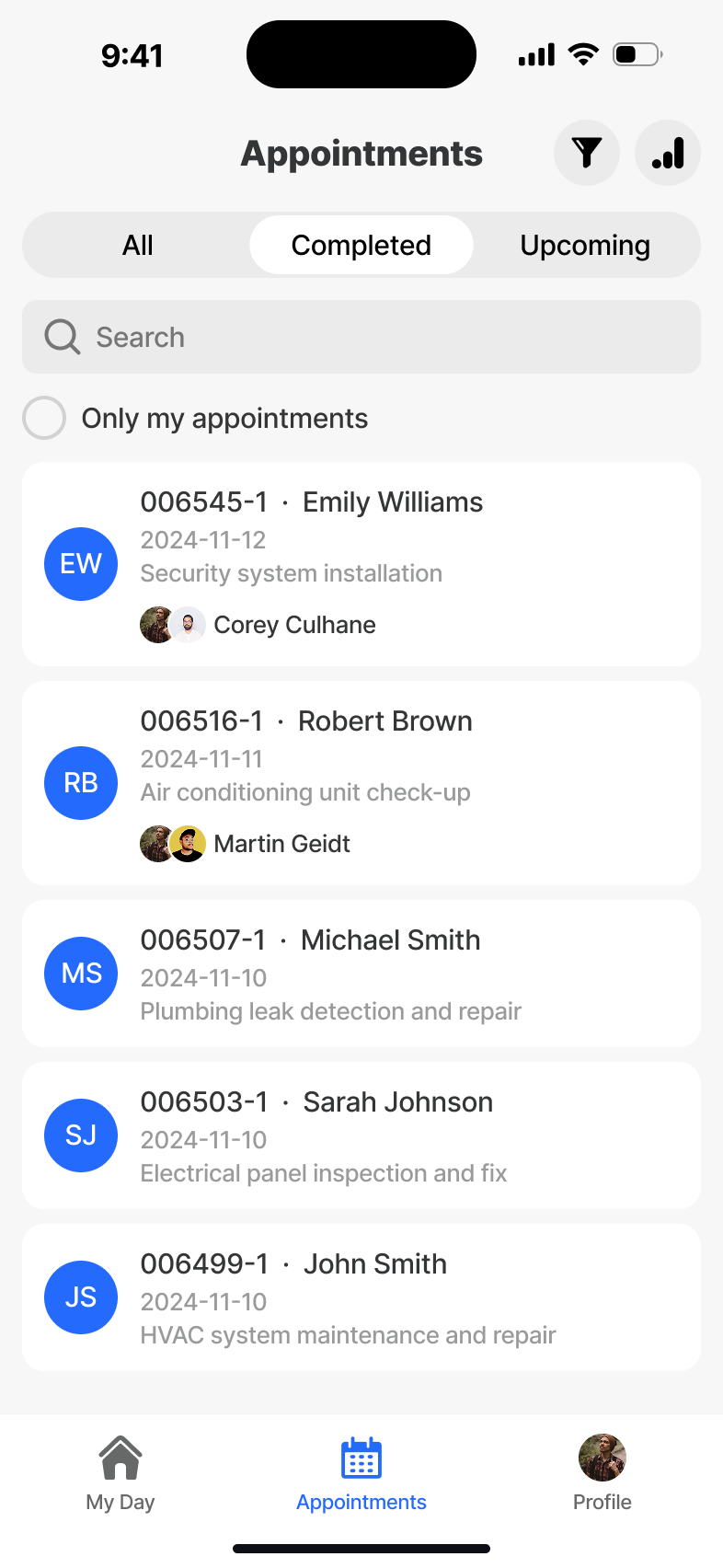
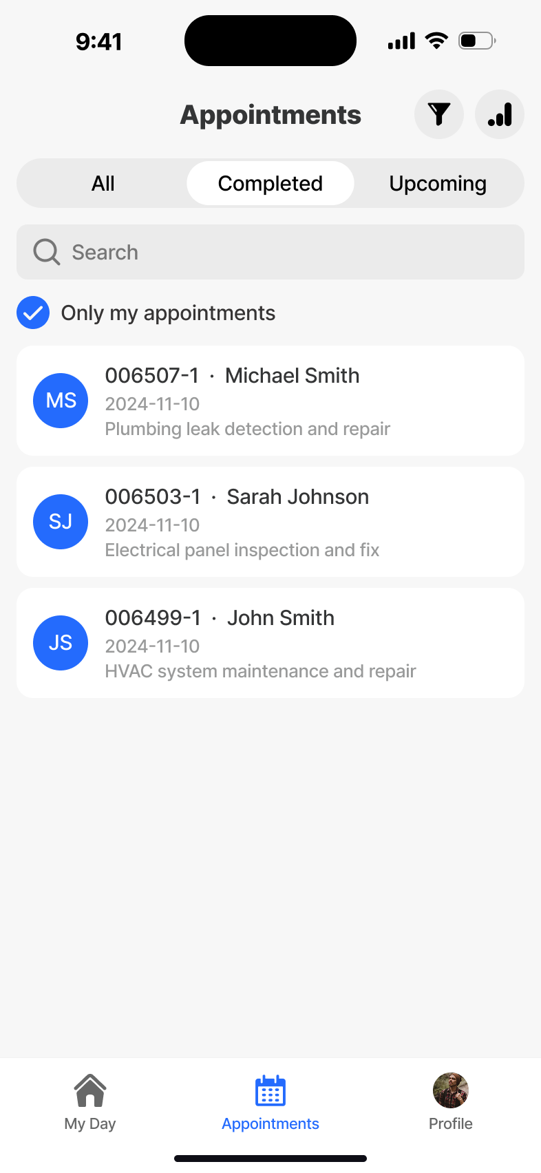
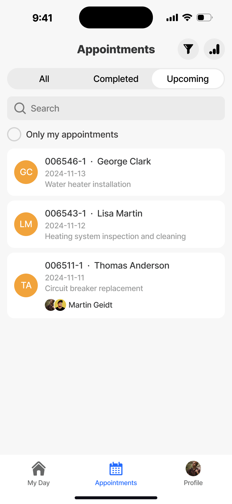
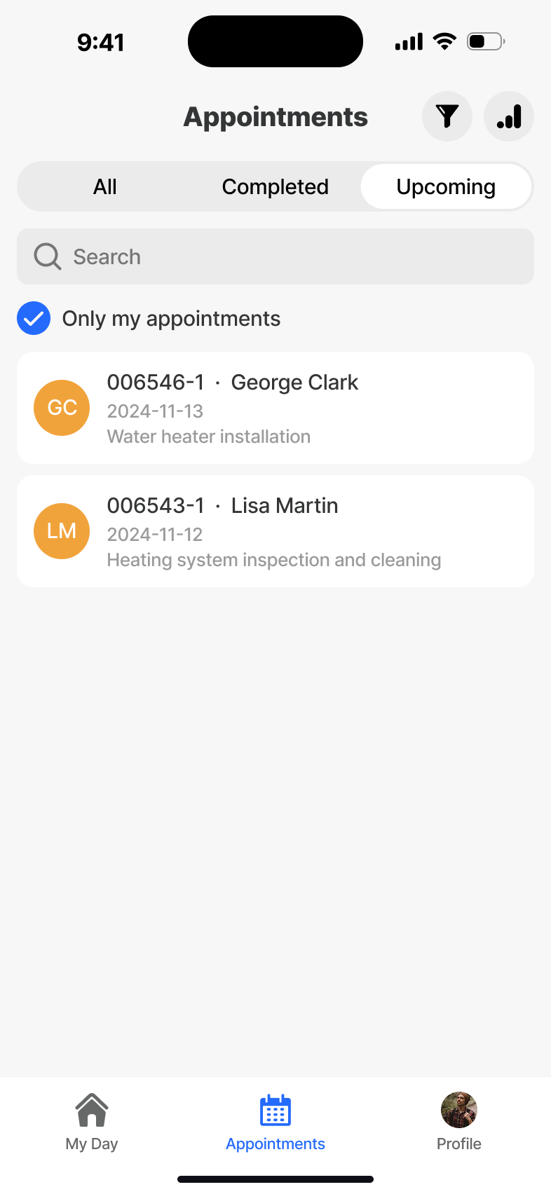
Appointments
The full pipeline - today, upcoming and historical jobs - with filters and grouping designed for one-handed scanning in transit. All appointment data is offline-readable once synced to the device.
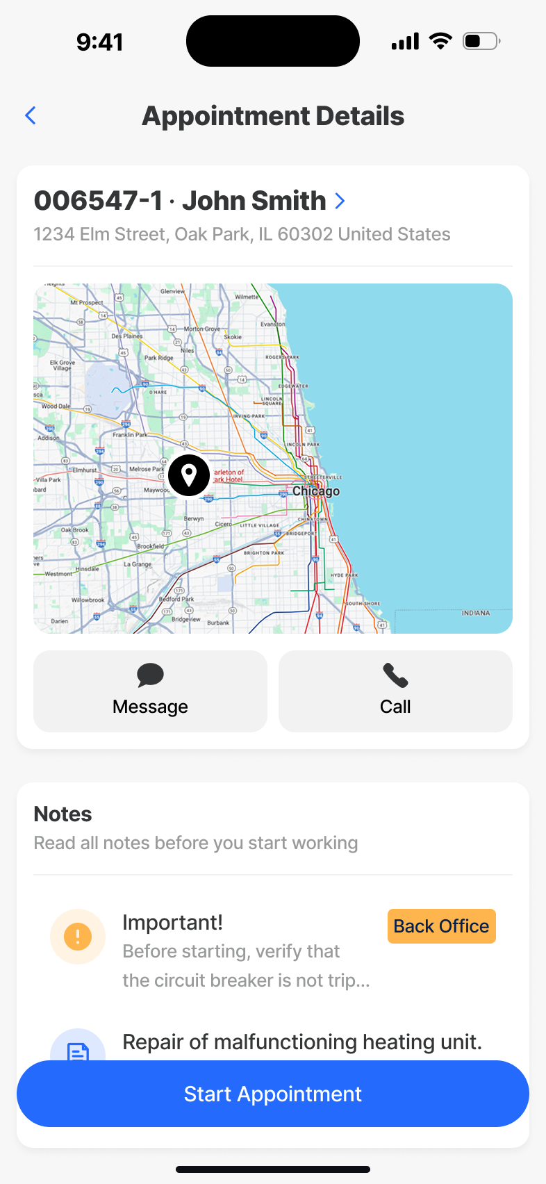
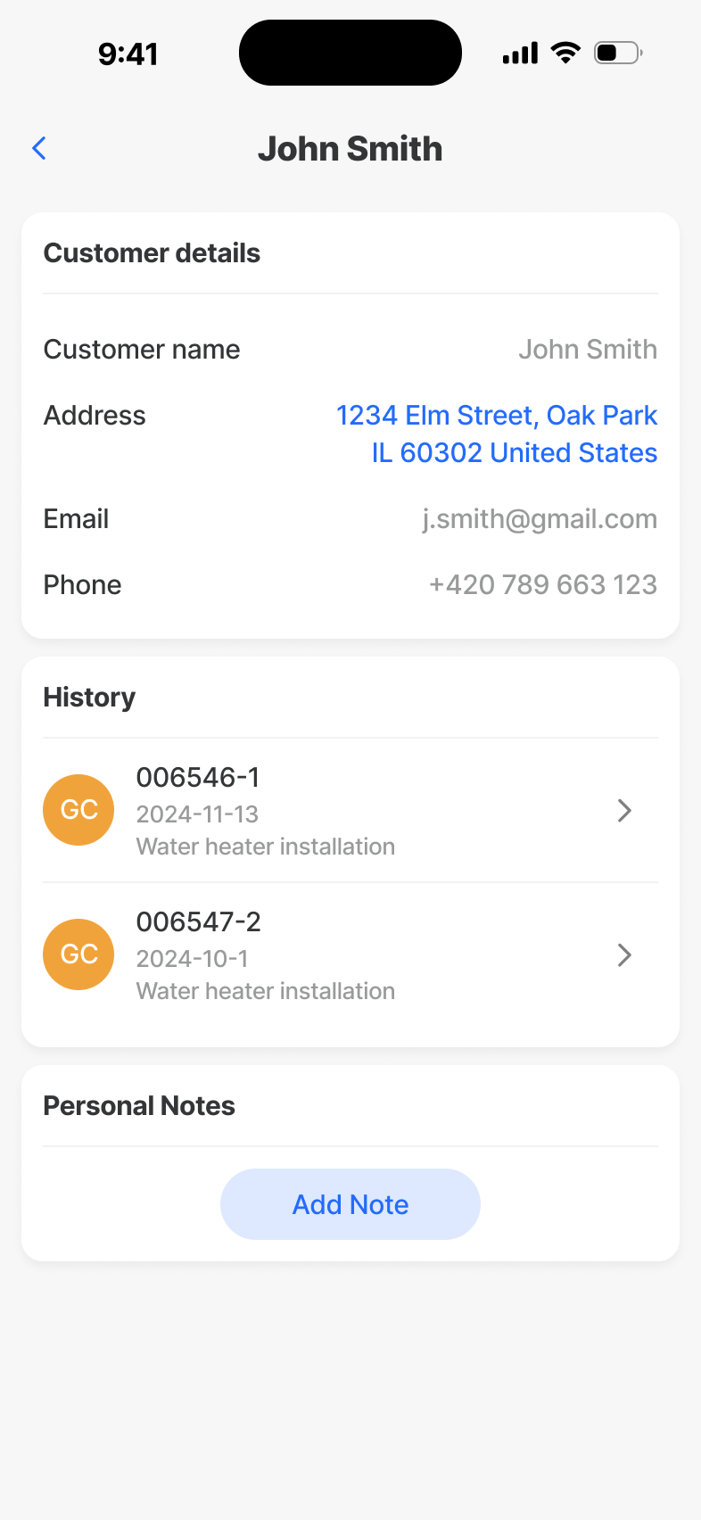
Appointment Detail
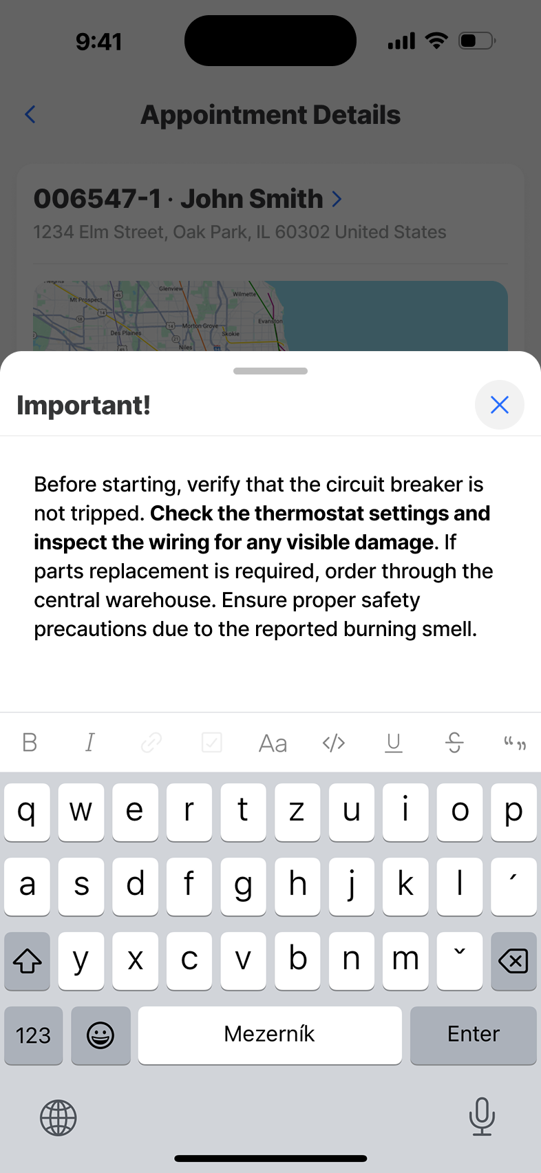
Everything the technician needs to walk into a job: address, contact, equipment, history, attachments. Optimised for skim-then-act, with the primary action - start the job - always within thumb's reach.
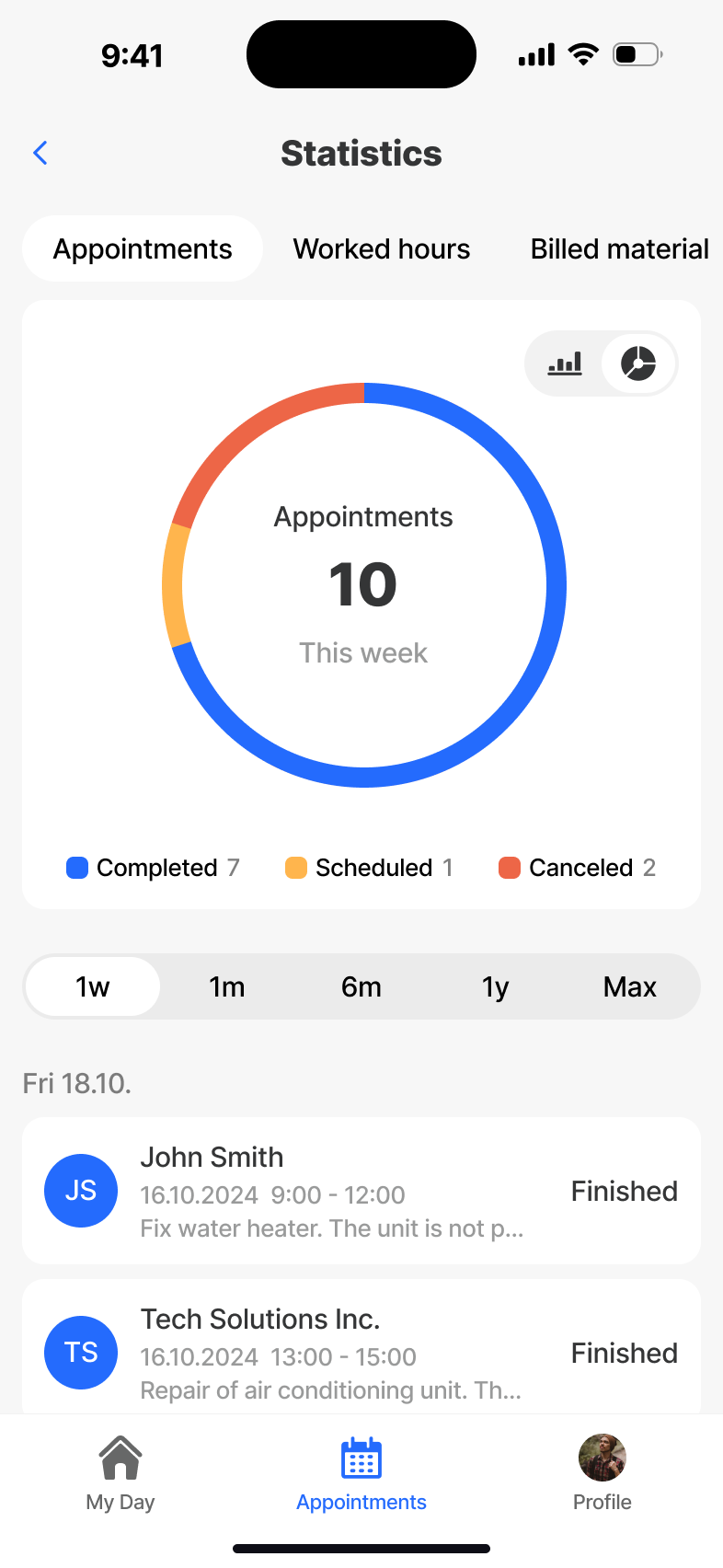
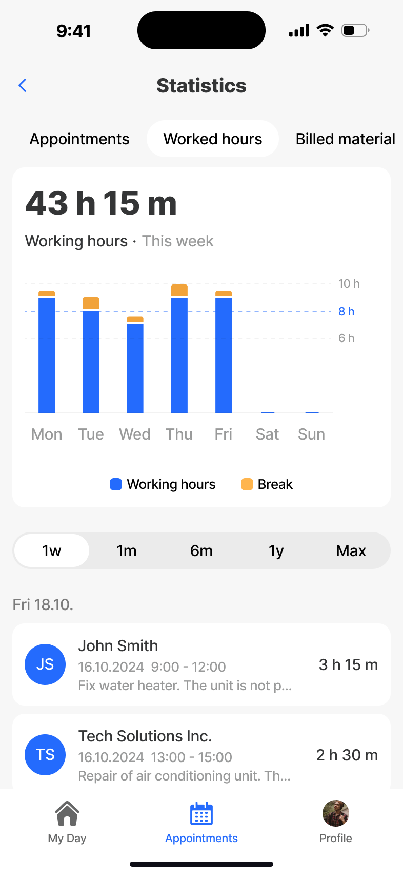
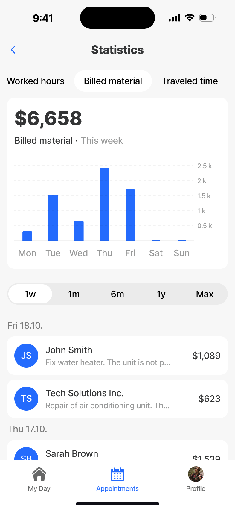
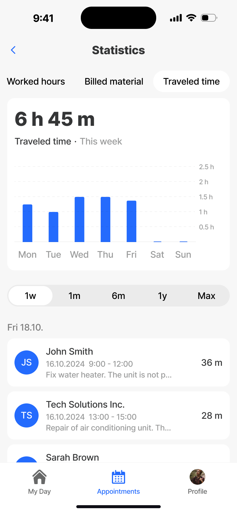
Statistics
A personal performance view - appointments completed, billed time and material, trends across the week. Designed so technicians see their own wins, not a surveillance dashboard.
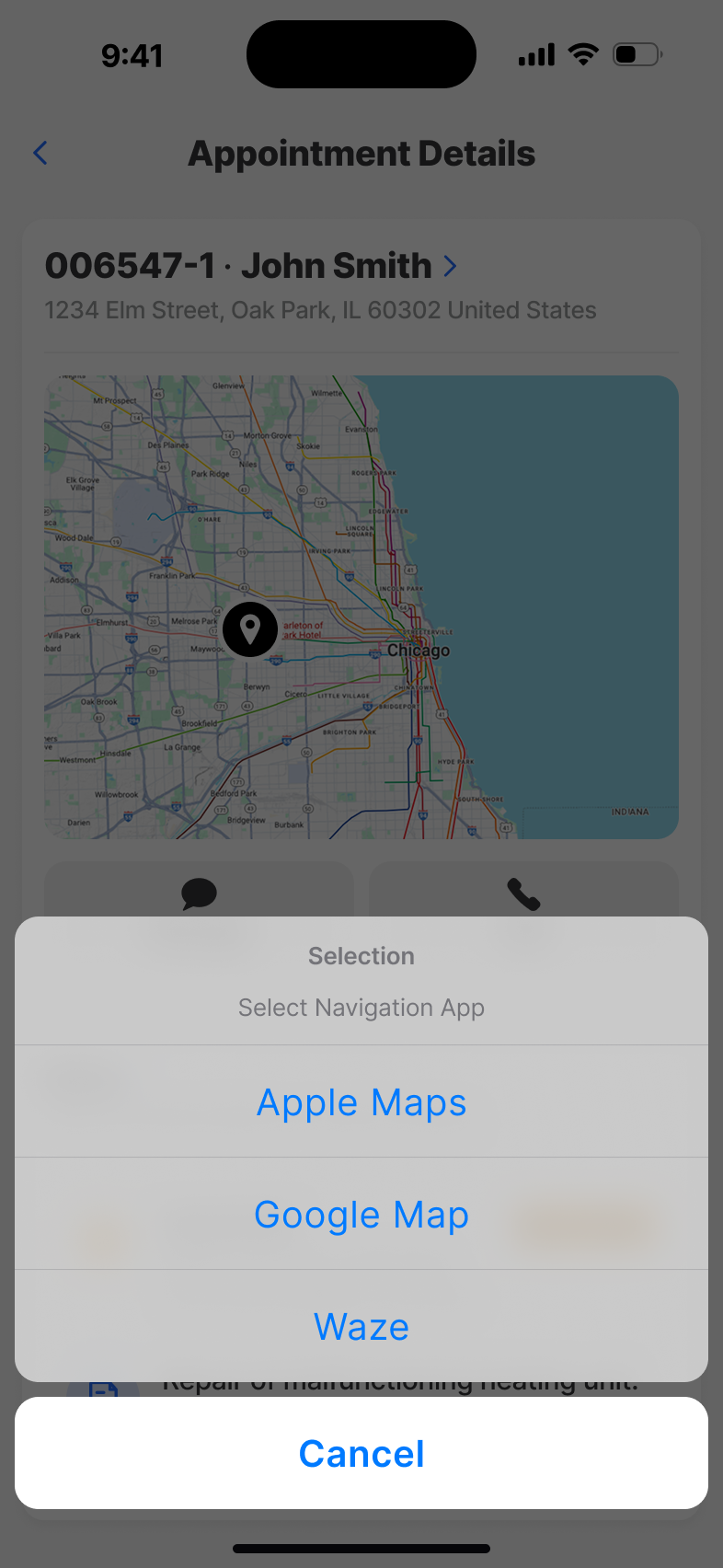
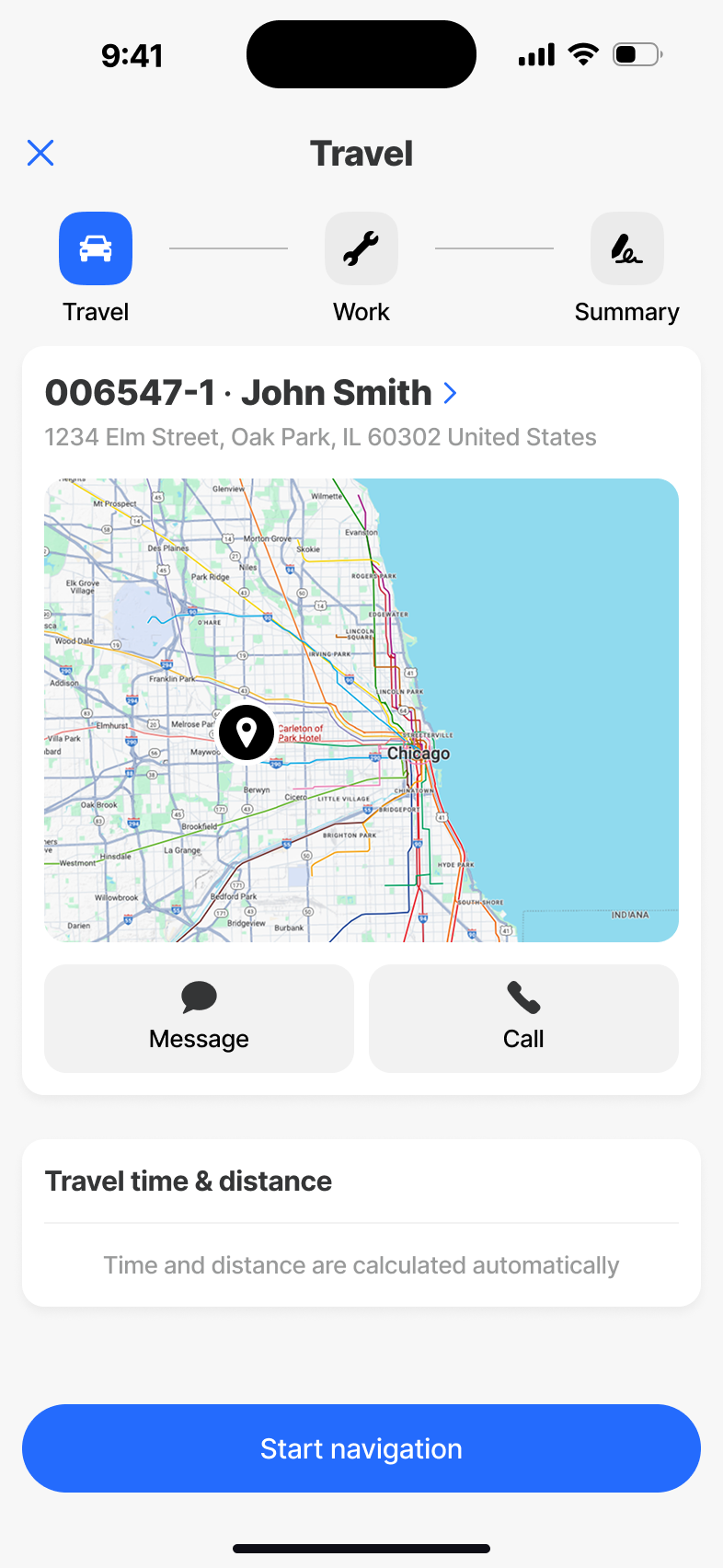
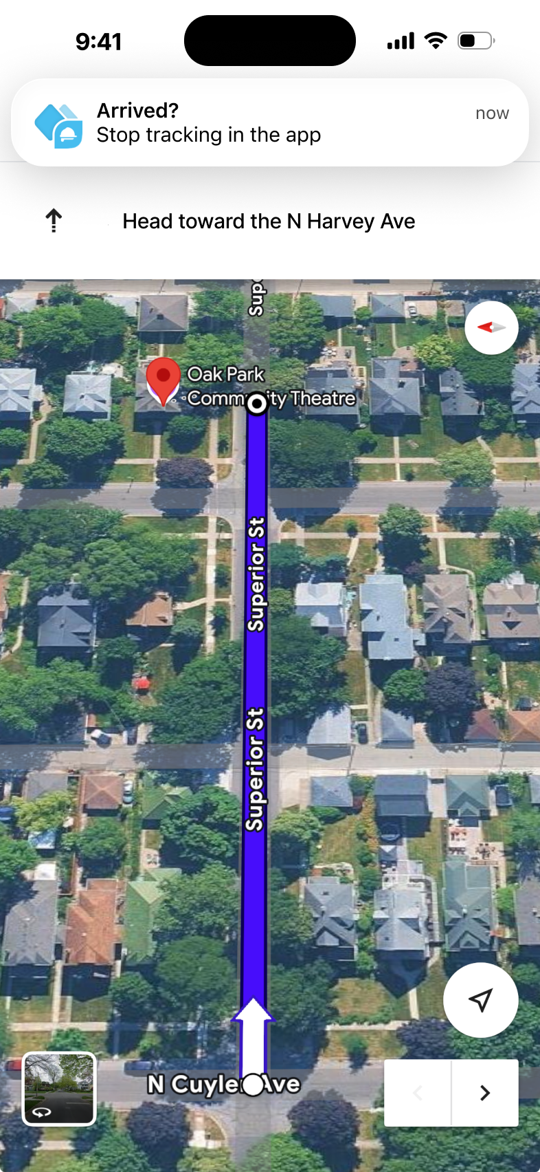
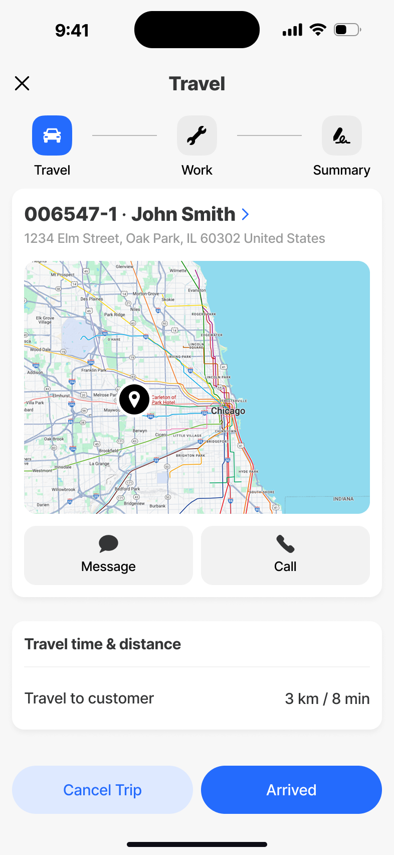
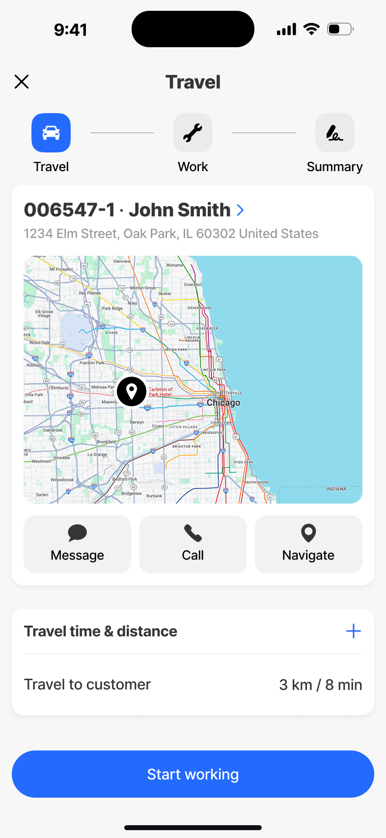
Travel
The drive between jobs, captured without effort. Travel time is logged automatically, route changes are absorbed without breaking the day, and the next appointment is always one tap away.
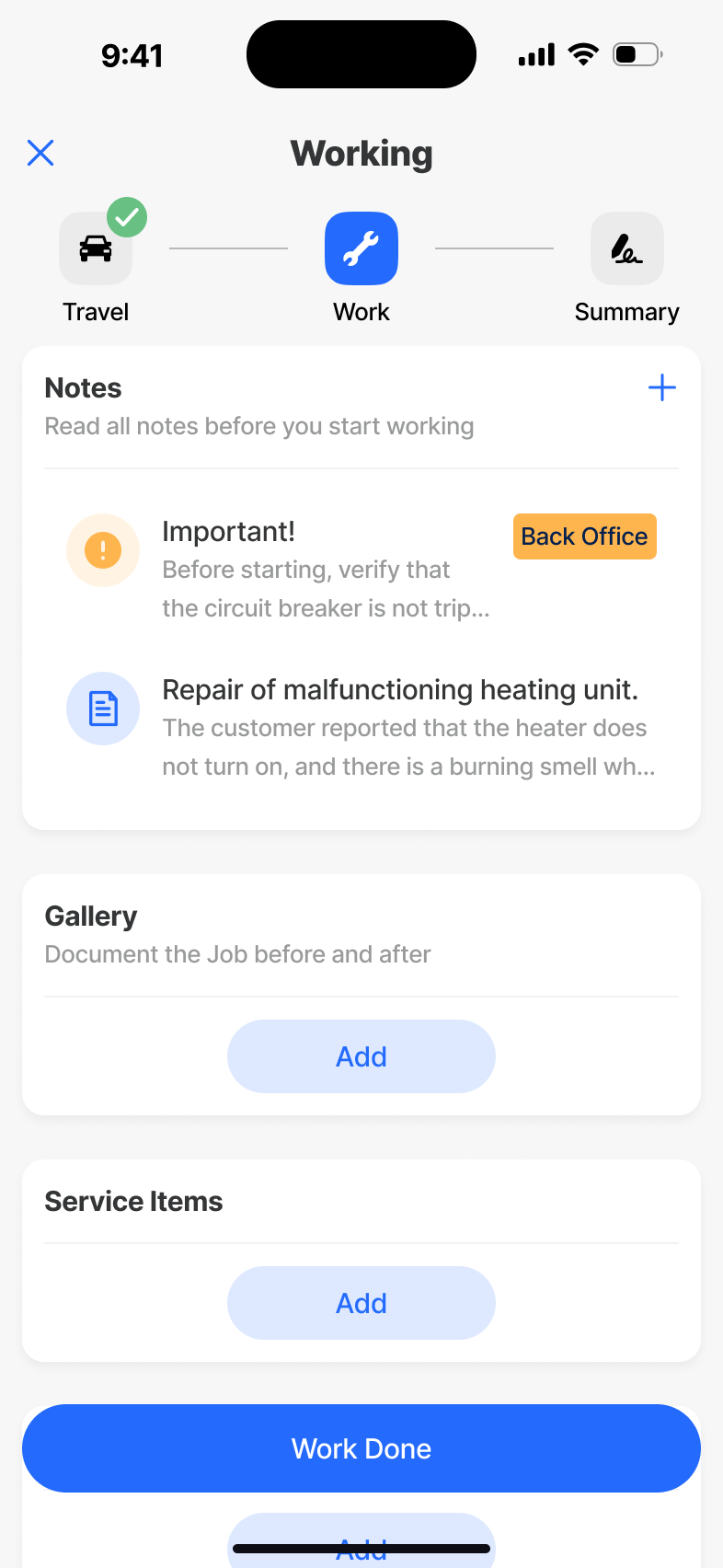
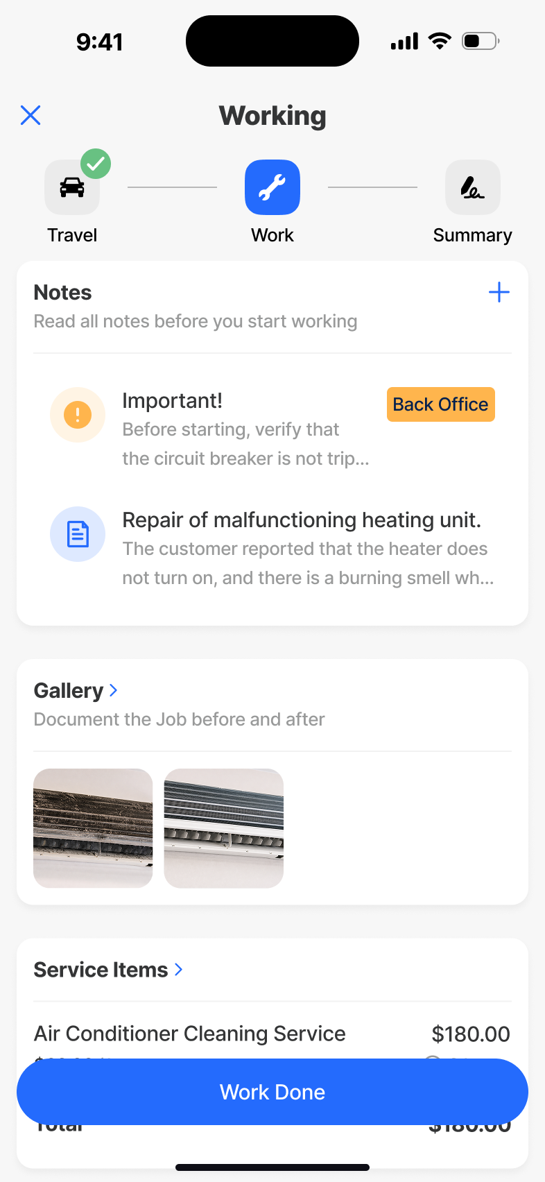
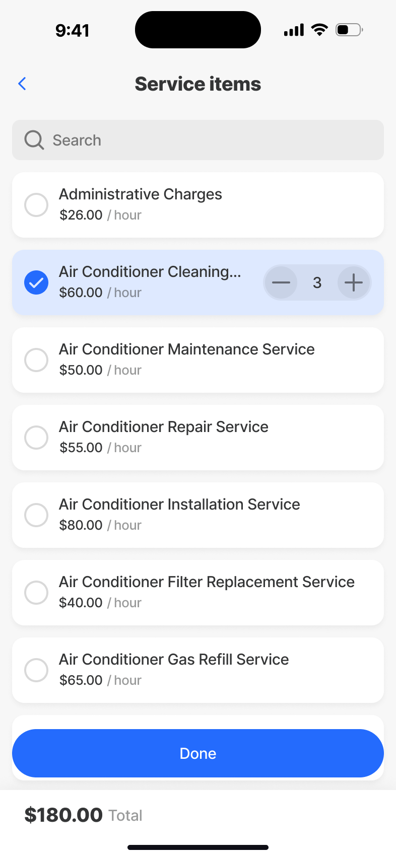
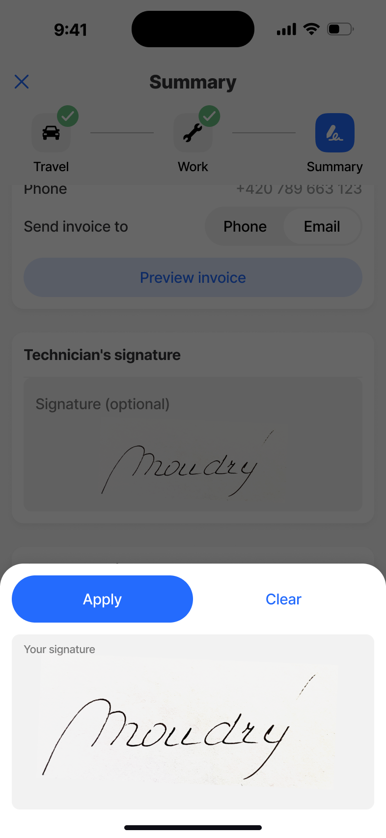
Working
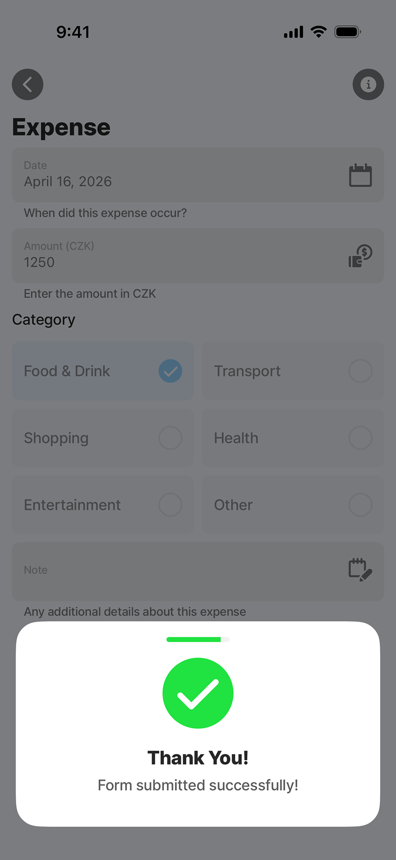
The active job. Checklists, time, parts, photos and notes - all writeable on a glove-touch screen with no signal - and all stitched together by a state model that survives interruption, lock screens and battery cycles.
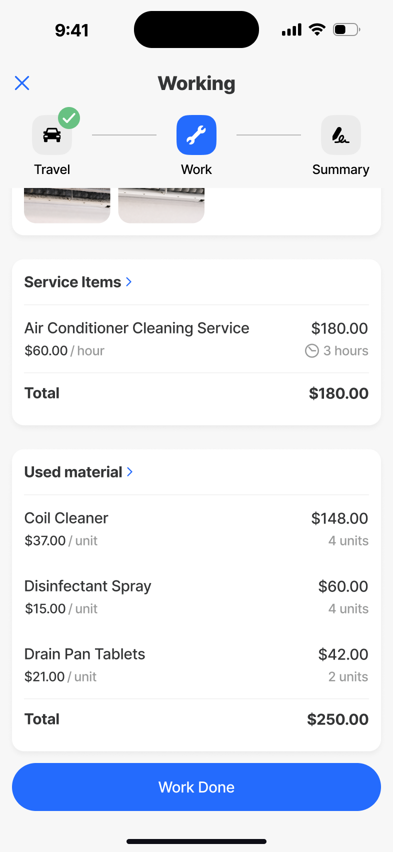

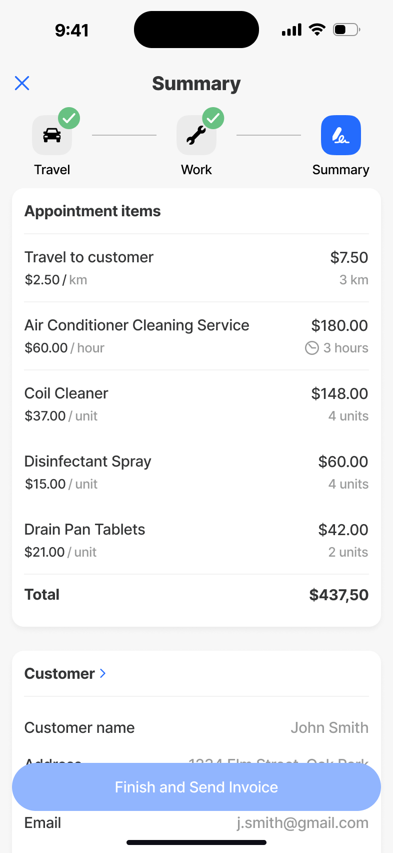
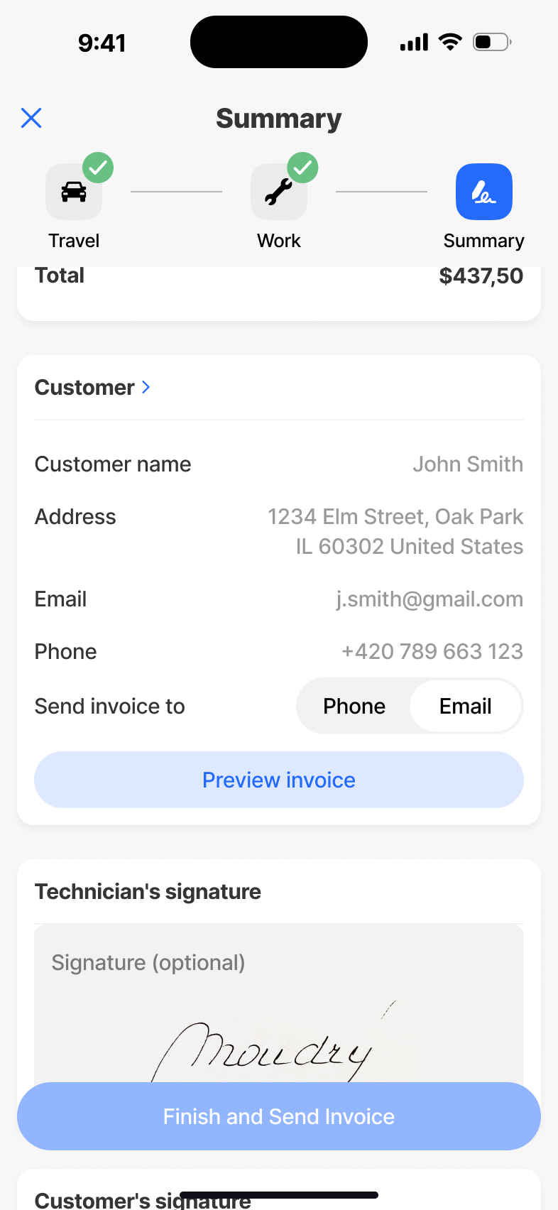
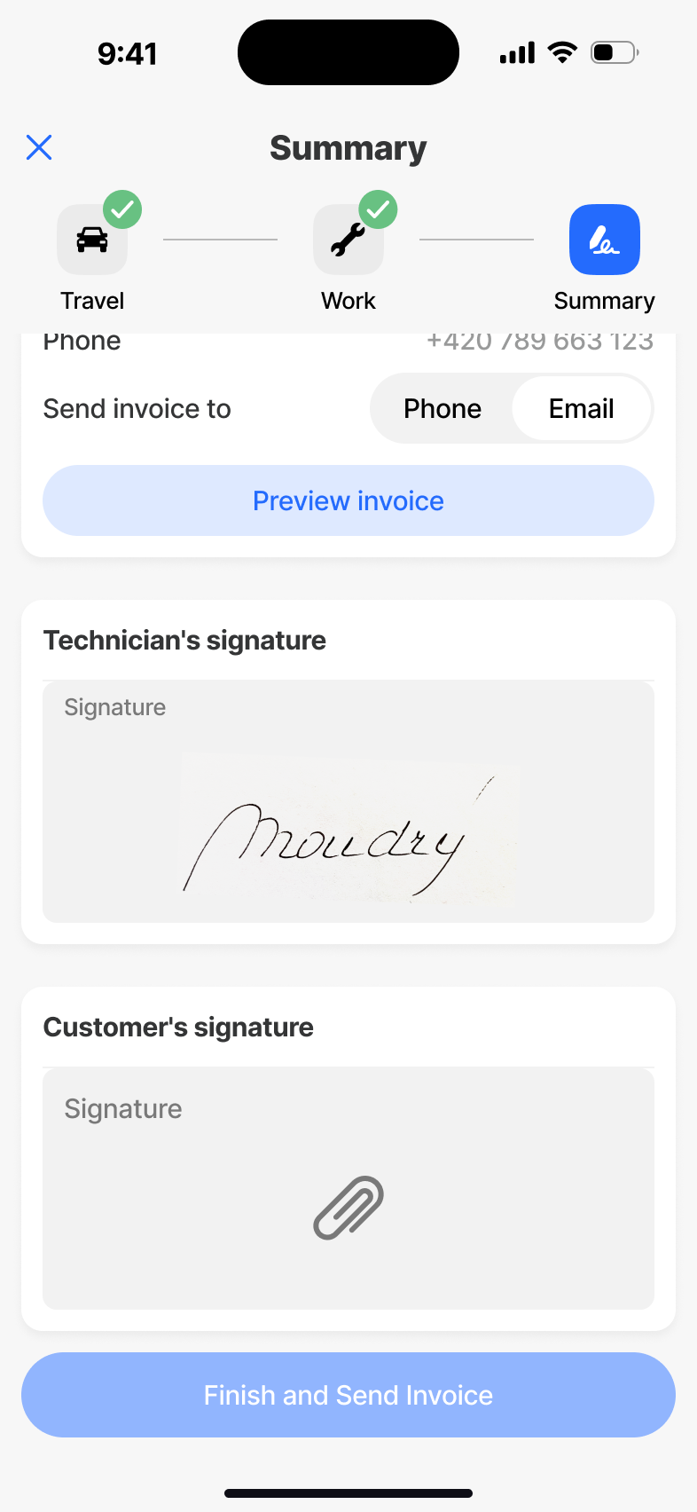
Summary
The end of a job. A concise review of what was done, what was used and what the customer needs to confirm - turning a finished visit into clean, billable data the moment a signal returns.
What we shipped.
The work was in what I removed.
The original plan broke each appointment into many granular steps. Tidy on paper, broken in testing - technicians lost orientation between micro-screens and kept asking where the rest of the information was. So we modelled the appointment as a single Travel → Work → Summary cycle and put everything the technician needs for that stage in one place. Same instinct later killed the calendar - PdM wanted a peek at tomorrow on the home screen, but it pulled focus from "today", the only thing that matters between sites. I argued for cutting it. We did.
In a tool people use under pressure, every additional step is a liability. The design moved from "what do we add?" to "what can they do without?". That's the question I'd lead with on the next field product, not bury in iteration.
← Back to all workJigx Forms
An AI-powered form builder that turns natural language into enterprise forms in minutes - no fields, no logic, no schema work required from the user.
Describe it. Plan it.
Build it in minutes.
The thirty-second version.
Problem
Every Jigx customer needed custom forms - inspections, reporting, internal workflows - but the path to one was technical, slow, and produced inconsistent results. Non-technical users couldn't build what they needed without a developer in the loop.
What I did
Led end-to-end UX for an AI-driven builder. Argued for a visible Plan step instead of a black-box generator, collapsed two competing form sections into one All forms list with filters, and resisted duplicating analytics into mobile - wired Submissions to deep-link into the web Insights view instead.
Outcome
Simple forms shareable in under 3 minutes, richer ones in ~5 minutes as users tune the look. Navigation collapsed from a confused hierarchy into a single All forms list with Owned / Shared filters.
Form building was slow, technical, and inconsistent.
Across the Jigx platform we kept hitting the same pattern: customers needed bespoke forms for reporting, inspections and internal workflows, but the path to one demanded technical fluency. Non-technical users couldn't move without a developer. Developers spent hours on what should have been a five-minute job.
The opening question wasn't "how do we make a faster builder?" - it was "how do we move users out of the mental model of building a form and into describing what they need to collect?"
The goal wasn't a simpler builder. It was a different way of working - where AI carries the complexity and the user keeps confidence and control.
How I worked through it.
Where the friction lived
Mapped the form lifecycle end-to-end with PdM and customers. Pinpointed the moments where users stalled: choosing fields, naming things, modelling data, and figuring out what to do with submissions afterwards.
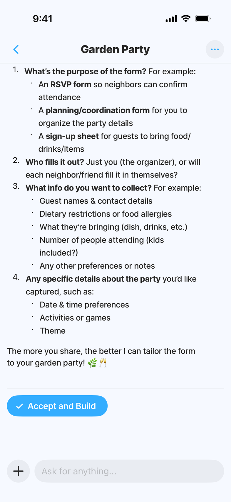
Plan before Build
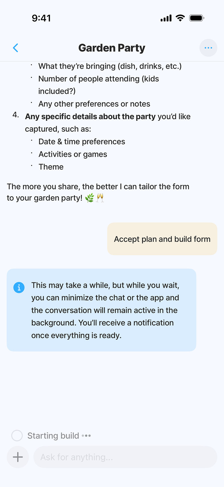
Decided early against a black-box generator. The product needed a visible Plan step where the user reviews structure and answers clarifying questions - so AI feels fast and trustworthy, not magical and risky.
Prompt, Plan, Build
Prototyped the three-stage flow at different fidelities, including failure modes (bad prompt, partial Plan, mid-Build edits). Tested how much AI explanation users actually wanted vs. how much got in the way.
One list beats two
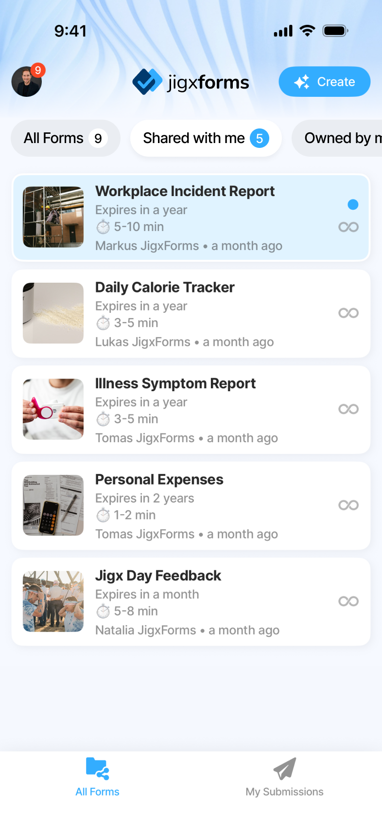
Tested navigation models with real users. The early split between "my forms" and "shared with me" felt obvious on paper but cost more than it bought - people asked "which list am I in?" instead of "which form do I need?". Collapsed both into one All forms list with filters and the question went away.
App and web, hand in hand
Worked closely with engineering across mobile and web. Wired Submissions in the app to deep links into the web Insights view, so power-users naturally flow to where the heavier analytics live.
From All forms to Submissions, in one continuous flow.
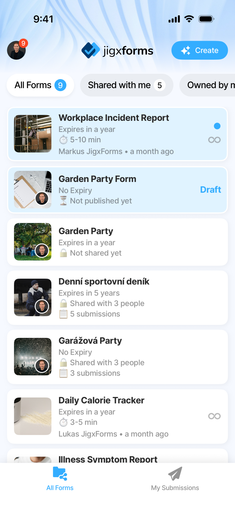
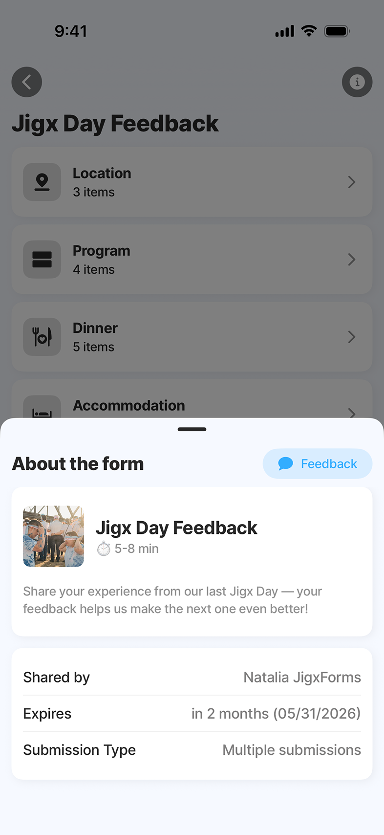
One home, one flow. All forms - owned and shared - live in a single list with filter chips. From there: AI Builder, Preview, then Share, Settings and Submissions on one Form Detail surface. No separate sections to switch between, no settings tree to hunt through.
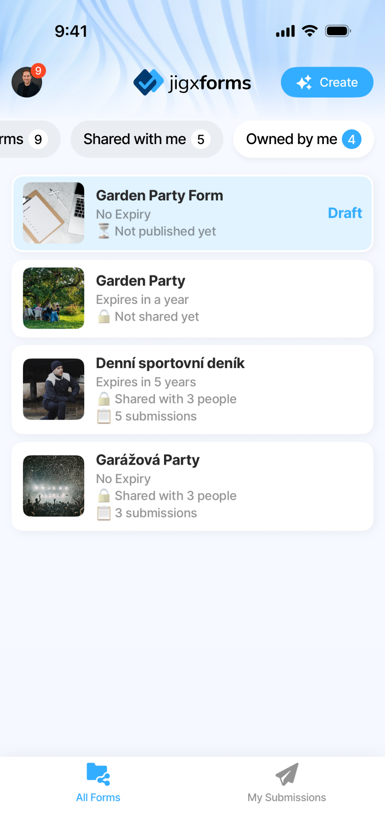
All forms
A single home for everything the user can see. Two filter chips - Owned by me and Shared with me - replace what used to be a confusing split between separate sections, so people stop wondering where their form is and start working with it.
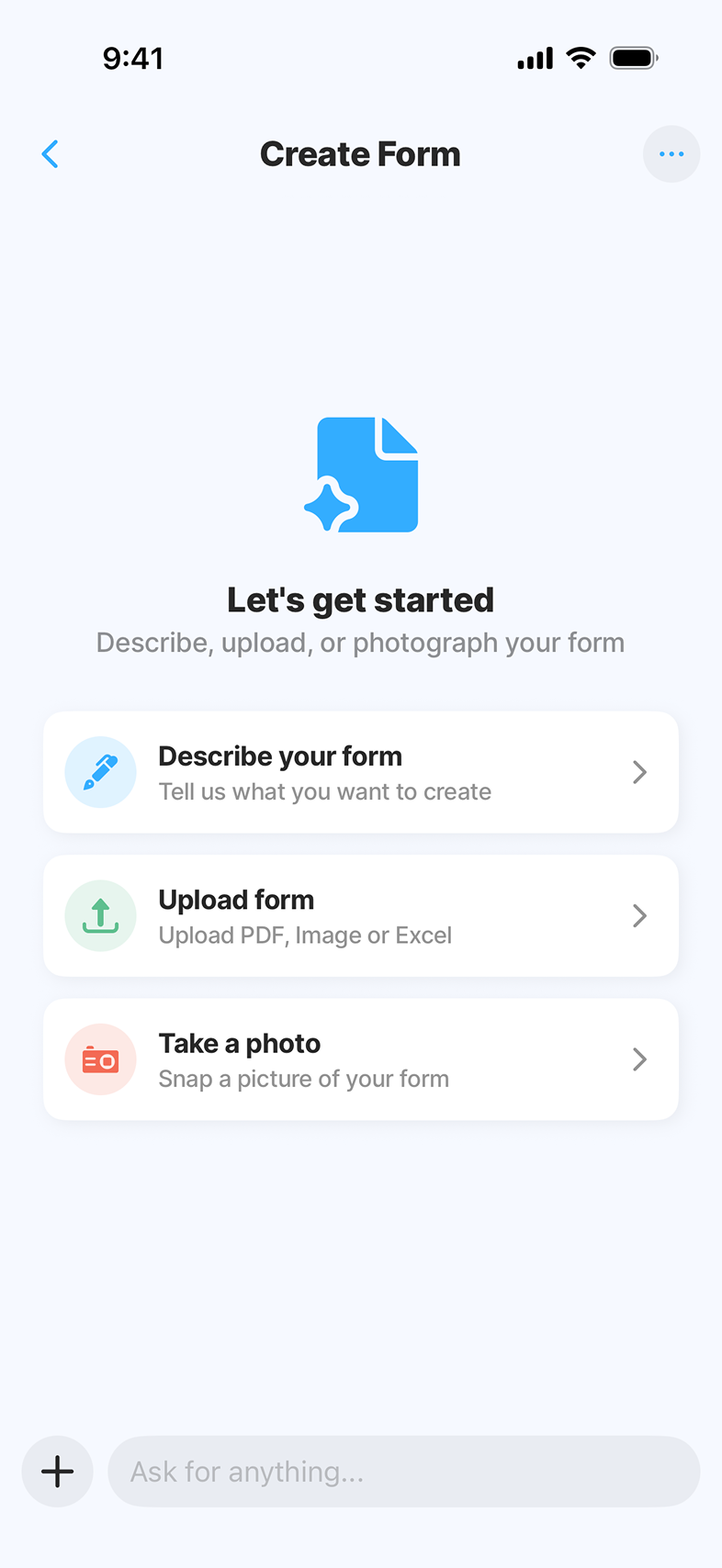
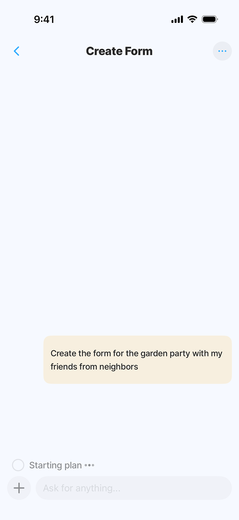
AI Builder
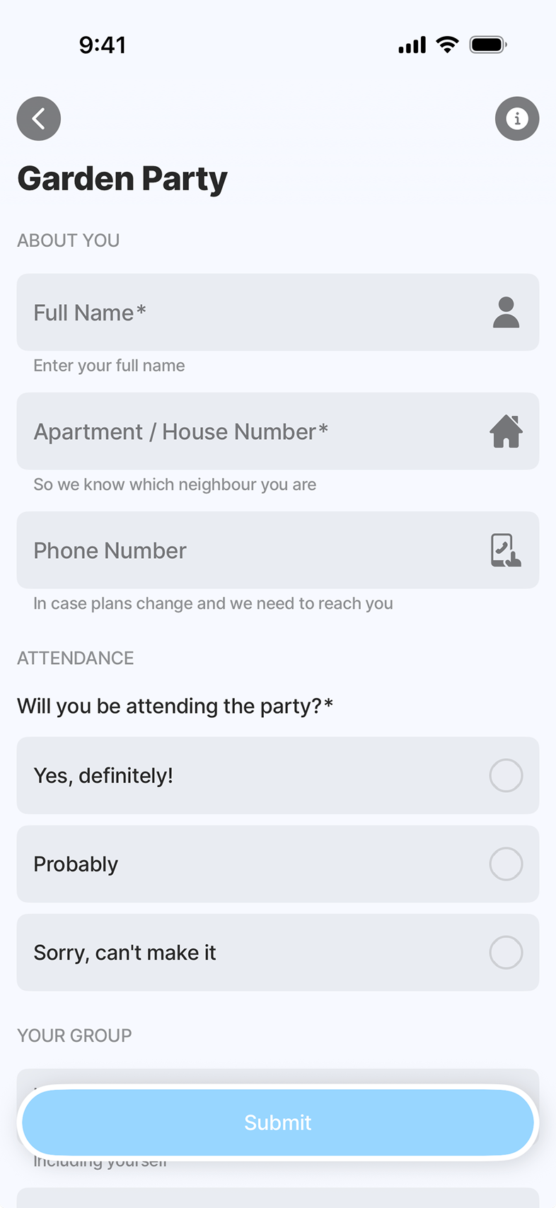
The user describes what they need in plain language. They can also upload an existing document or take a photo of one as reference. In a few seconds, AI generates the form end-to-end - UI, logic, validation, data model - and drops the user into a builder where natural language stays available and tuning happens in place.
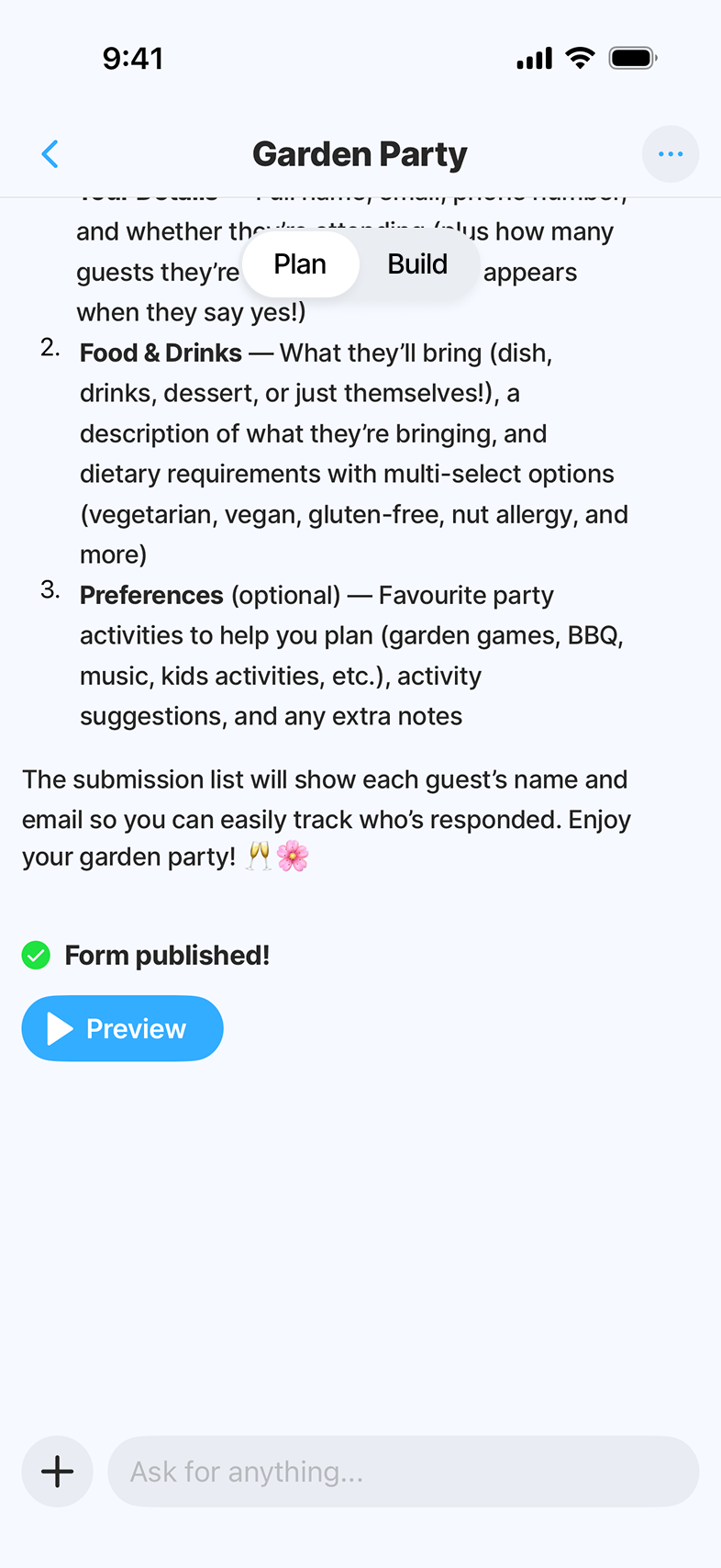
Preview
Before sharing, the user walks through the form exactly as recipients will - empty, in-progress, filled. This is where confidence in the AI output gets built. Misunderstandings get caught here, not after the form ships.
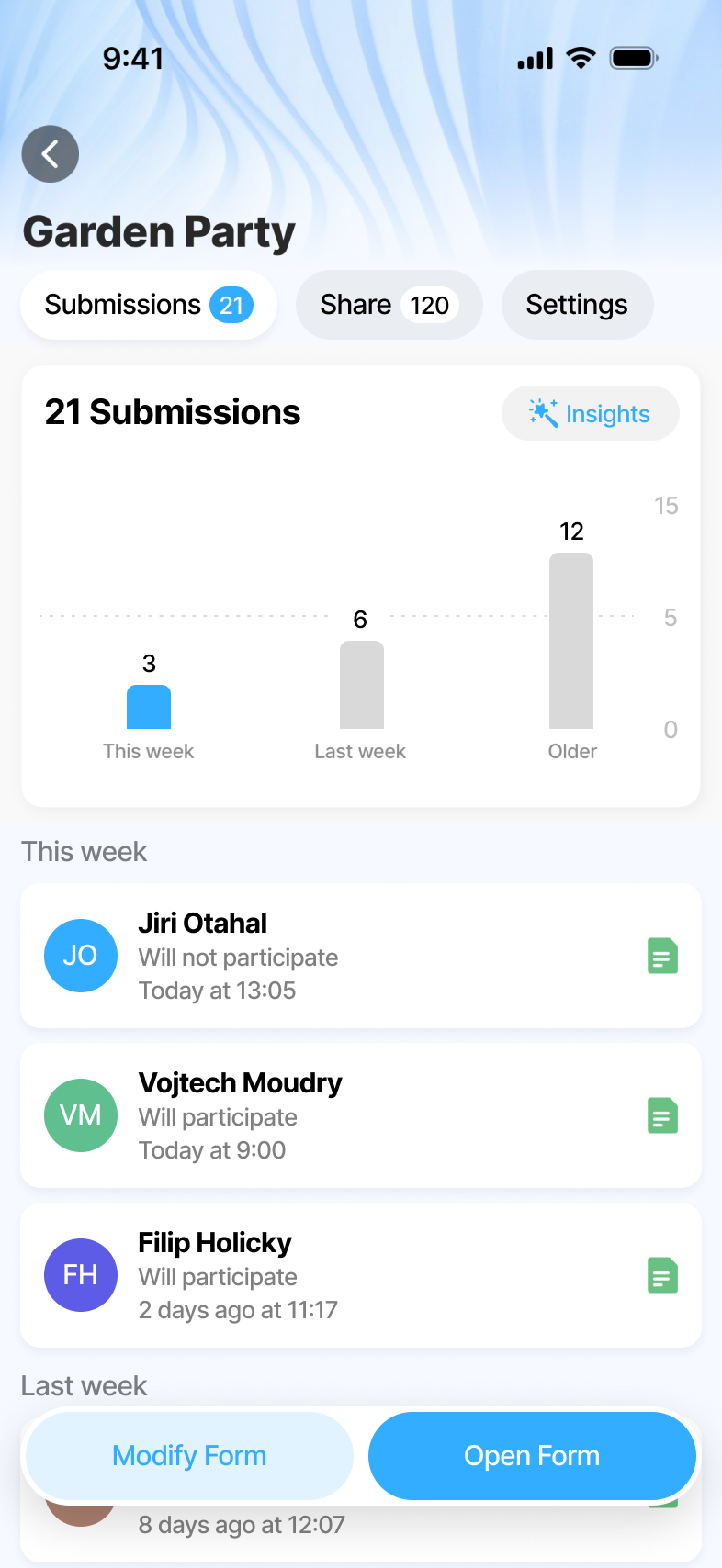
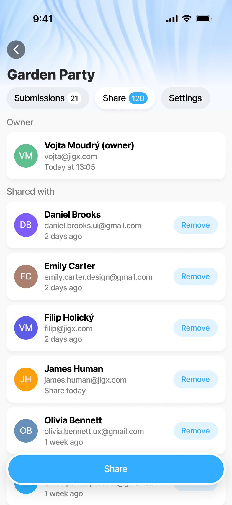
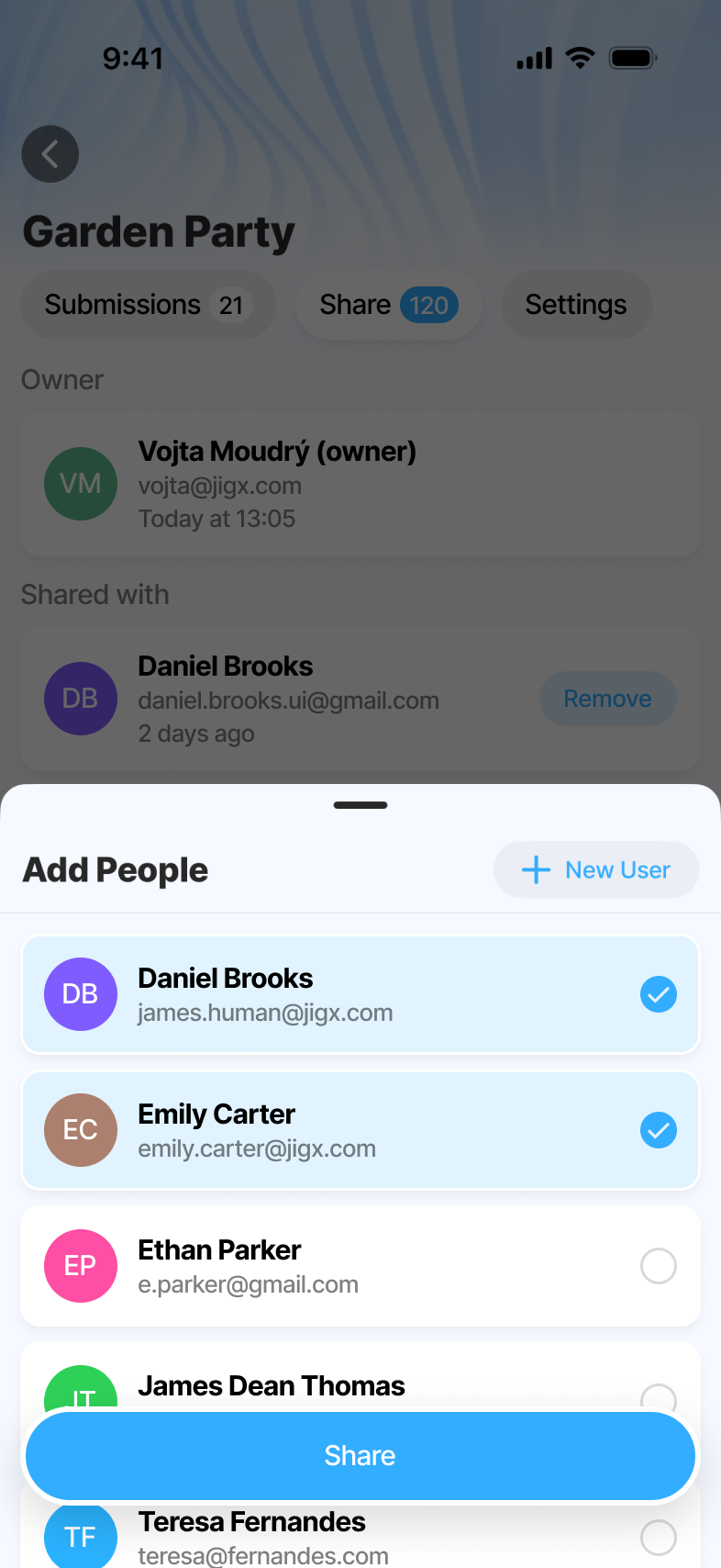
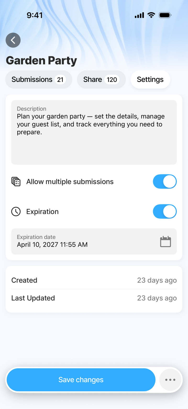
Share, Settings & Submissions
Submissions deep-link into the web Insights view for heavier analysis. Mobile is the trigger. Web is where power-users analyse. Everything else - sharing the form, configuring behaviour, reviewing first responses - lives on one Form Detail surface, no settings tree to hunt through.
What we shipped.
Trust comes from showing your work.
The hardest call on this product wasn't a feature - it was the AI's role. The fastest version was a black box: prompt in, finished form out. We rejected it and kept the Plan step non-negotiable. AI proposes, asks the questions that sharpen the proposal, and only builds the real form on confirmation. The Builder and the Preview serve the same instinct - make the AI's work visible at every step where the user can still change their mind.
With an AI product, the design problem isn't "how do we make the model feel magical." It's where to let the user see and stop the magic. Get that right and people trust the output enough to ship it. Get it wrong and they don't ship at all.
← Back to all work